


Google started testing a homescreen redesign for Messages back in June and is now widely rolling it out to stable users after months of beta testing.
Instead of a search field, there’s an app bar with the four-color “G” logo followed by “Messages” and a magnifying glass icon. This is very prominent branding amidst the ongoing RCS push that emphasizes how this messaging experience is brought to you by Google.
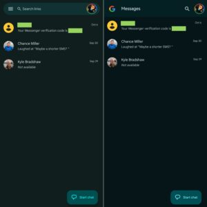
The big change is how Google Messages no longer uses a navigation drawer, which helps modernize the app. Instead, you can find Archived, Spam & blocked, Mark as all read, and Device pairing by tapping your profile avatar in the top-right corner. A prompt bubble explains how those items are now “in one place” alongside app settings.
Google has also updated search, which now has a smaller but still obvious touch target, so you get a grid of categories instead of the previous carousel. You’ll find a shortcut to your Starred texts/chats here, along with filters for Unread, Known, Unknown, Images, Videos, Places, and Links.
As part of this change, the Message organization feature introduced last year has been removed. You no longer have tabs at the top for All, Personal, and Business, though the “Auto-delete OTPs after 24 hrs” option remains in settings.
Google Messages users on the stable channel are now seeing this homescreen redesign. (If not, try “Force stop” from App info.) It took quite a long time for Google to widely introduce this change, though it hasn’t been officially announced yet. It joins other recent homescreen launches like a prominent RCS badge and read receipts in the conversation list.
Source: 9TO5Google